Design
Building a Brand Identity That Won Hospital Contracts
4 min read
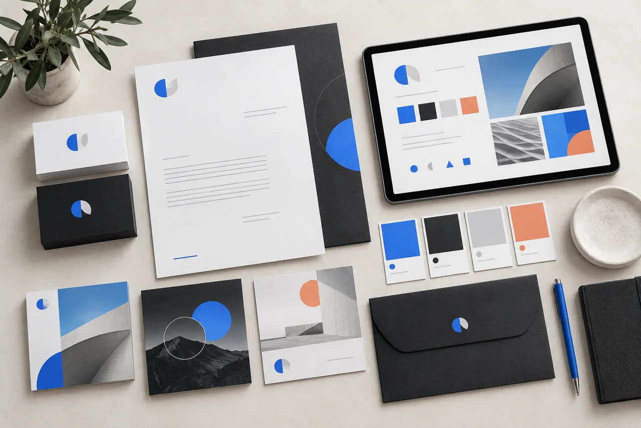
MediCore Supplies had a good product but looked unprofessional. Their materials — business cards, letterheads, email signatures — were inconsistent and unpolished. Hospital procurement teams weren't taking them seriously.
The Brief
Build a complete visual identity from scratch. The result had to signal trust, precision, and professionalism — the three things hospital buyers need to feel before signing a contract.
The Design Decisions
Colour system: Clinical blue (#1B4F8A) as primary, with clean white space. No gradients. No decorative elements that couldn't justify their presence.
Typography: A geometric sans-serif for headings (precision, modernity), paired with a humanist sans for body text (warmth, readability).
Logo: Abstract mark representing a shield and a cross — protection and medical care. Designed in Adobe Illustrator with strict grid alignment. Works at 10px favicon size and 2m banner size.
Deliverables
- Logo suite (primary, horizontal, icon-only, reversed)
- Colour palette + usage guidelines
- Typography scale
- Business cards (print-ready)
- Letterhead template (Word + PDF)
- Email signature HTML
- Brand guidelines PDF (24 pages)
The Result
Two new hospital procurement contracts within 3 months. The client credited the rebrand directly in their pitch.